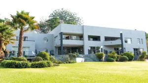
This modern, quirky home was originally designed by another architect and then extensively modified – in line with the owners’ requests – by architect Victor Utria (from Fleet Utria Architecture). Utria has undertaken a number of residential projects, although he is perhaps best known for his large-scale commercial designs, like the Causeway Post Office (with the huge cut-out a square in the middle) and the Runhare House building (with the fallen-over pillars and small amphitheater in front). Utria’s designs tend to incorporate unusual and thought-provoking elements that blend basic structural and functional designs with whimsical, almost sculptural elements. This beautiful home illustrates many of Utria’s design signatures. It has oversized circular windows, walls of glass bricks – a material used extensively at the Causeway Post Office – a spiral staircase with a central column topped by a spherical light, long views through the open plan spaces and several skylights which transform ordinary spaces into design features.
His designs also tend to combine austere, modernist, geometric shapes with softer curved structures. The main entrance to the house illustrates a number of these design features. A small square portico in front of the main entrance is basically a concrete slab supported on one corner by a substantial, fat pillar. Two sides of the slab are attached to the main structure of the house and thinner exposed pillars can be seen both side supporting the first floor slab and the roof, so that the structural elements are clearly visible and you can see how the house is put together. Either side of the front door are blocks of glass bricks – on one side in a sort of inverted L-shape and on the other side in a stepped design. Cut into the centre of the portico roof slab is a large glass skylight which makes the heavy slab lighter and more delicate. The door is a small sculptural artwork in itself. It’s made up of different thicknesses of solid timber in a layered Z-shape that swivels on a central vertical hinge. One side of the door opening has a small clear glass panel set into the architrave while the opposite side has a large frosted glass panel in a geometric design combining straight lines and curves.
Above the entrance on the first floor of the building four huge circular windows soften the almost brutalist slab and pillar structure with the hard edged flat roof parapet visible above. This sculptural, architectural theme is echoed just inside the front door with a dropped ceiling section – painted in a different colour – with a curvy edge, which hangs above layers of S-shape sliding wooden doors concealing a storage space. The exterior walls of square glass bricks, which allow natural light into the entrance hall, are set opposite round openings within the interior walls, as well as low dividing walls topped off with more glass bricks. The low walls and circular openings allow extensive views of the interior which run almost the entire length of the building. Simple ceramic floor tiles which cover most the ground floor also add to a clean, uncluttered look that emphasises the very generously proportioned spaces.
Just to the right of the front entrance hall a spiral staircase sweeps up to the first floor. In front of the hall is a large dining room with big windows opening out to the large paved terrace and the pool and garden beyond. The dining room is separated from the main lounge by a low partition wall also with a stepped glass brick design. A double sided fireplace heats both the dining room and the lounge. Down along the open plan passageway is an additional smaller TV lounge which is more intimate and cosy. Across the hallway from the dining room is an open plan kitchen, recently renovated and refitted by Romeo kitchens, in a sleek classic black and white scheme with a movable centre island, a breakfast counter and chrome stools. The double door fridge is hidden behind cupboard doors that blend with the cabinets, the dishwasher is set under the counter and the ovens are set into the cabinetry so the kitchen has a sleek, almost minimalist look in keeping with the overall architectural design, although it’s superbly equipped for catering and entertaining on a large scale.
At the owners’ request Utria changed part of the internal layout of the house so that what was originally designed as parking garages on the east side of the house was converted to a self contained guest wing overlooking the swimming pool, with en suite bathroom. The pool, now in front of the house, was planned to be at the back of the house where the current garages and parking spaces are. Where the garages are now was originally designed as another lounge with the master bedroom above. What was intended to be the master bedroom is now their son’s room with a private bathroom and covered balcony. Utria opened up the front of the house more adding large sliding aluminium doors and windows.
He also extended the front verandah or deck area so that it runs almost the full width of the house and looks over the pool deck which is set a few feet lower down the sloping front garden. He also added the triangular shaped balcony which leads off the master suite upstairs and looms over the verandah like the prow of a ship. Upstairs there’s the son’s room, the master suite, two additional bedrooms that share a bathroom, as well a smaller lounge entertainment area and even space for a home gym set up. The upstairs lounge area is dominated by the spiral staircase which has a central circular column rising up through the centre and topped with a spherical light. There’s another square skylight over the lounge. Unlike the ground floor where most of the floors are ceramic tiles, the upstairs is mostly carpeted (except for the open plan lounge) keeping it warmer in winter and giving it a softer feel.
Liz Howes from Howes and Homes was recently consulted to give the home an update. Although built nearly 20 years ago the home is still structurally strikingly modern but the exterior colour scheme of neutral beiges and creams had become a little dated. Howes and Homes repainted the whole exterior – including the boundary walls – in more contemporary shades of greys and blues, which also serve to highlight some of the architectural features like the pillars and the balcony railings. Part of the deck around the pool had collapsed caused a tree falling onto it so Howes and Homes repaired pool surround. Inside the house parts of the downstairs were refreshed and repainted while most of the upstairs was repainted and a new ceiling and new lights were installed in the lounge space.
Two upstairs bathrooms were renovated with new fittings – baths, showers and tiles – but the master en suite bathroom was totally transformed. There had previously been a rather awkward passageway to the bathroom which was totally demolished. In its place now is a sliding door of wood and frosted glass, designed by the owner and made up by Howes and Homes’ carpenter. There’s a small modesty wall concealing the toilet and bidet but the rest of the bathroom is spacious and airy and three new windows were added to make the room much lighter. There’s a huge glass shower cubicle and a free standing oval bath as well as double vanity basins set into a black granite counter top. Pale tiles and plain white walls give the new bathroom a luxury spa look. No doubt this stunning home will still be a shining example of great modern design for at least another 20 more years.
Text by Michael Nott
Photography by Michele Fortmann